Bienal Femsa - Futura .
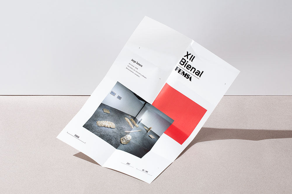
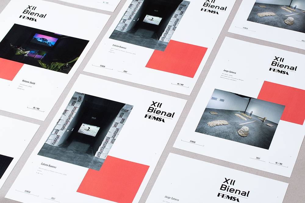
The Bienal Femsa is a visual arts contest that was created with the purpose of recognizing, strengthening, stimulating and diffusing artistic creation in Mexico. Futura was in charge of designing both the graphic identity and the art book of the XII edition.
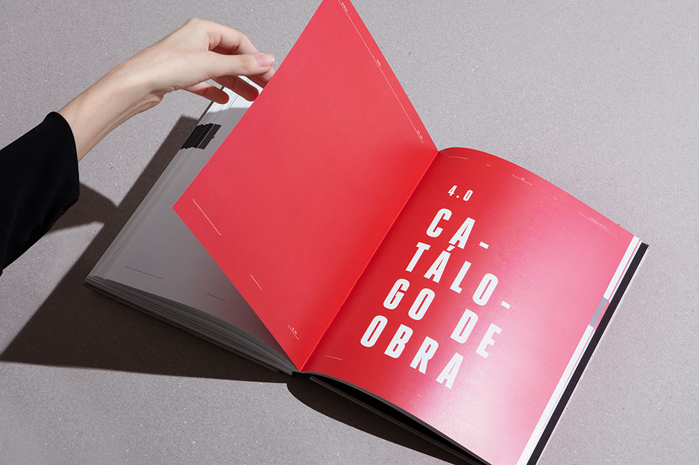
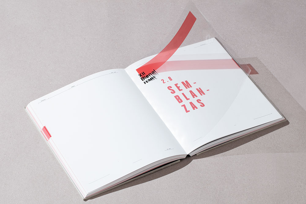
We created an identity with editorial balance and geometric intervention within the space, demonstrating that form and function do not compete, but rather complement each other. We created a harmonic proposal: with an adequate use of blank spaces, a reticulated editorial design and using a protagonist color that was distinctive for the event.
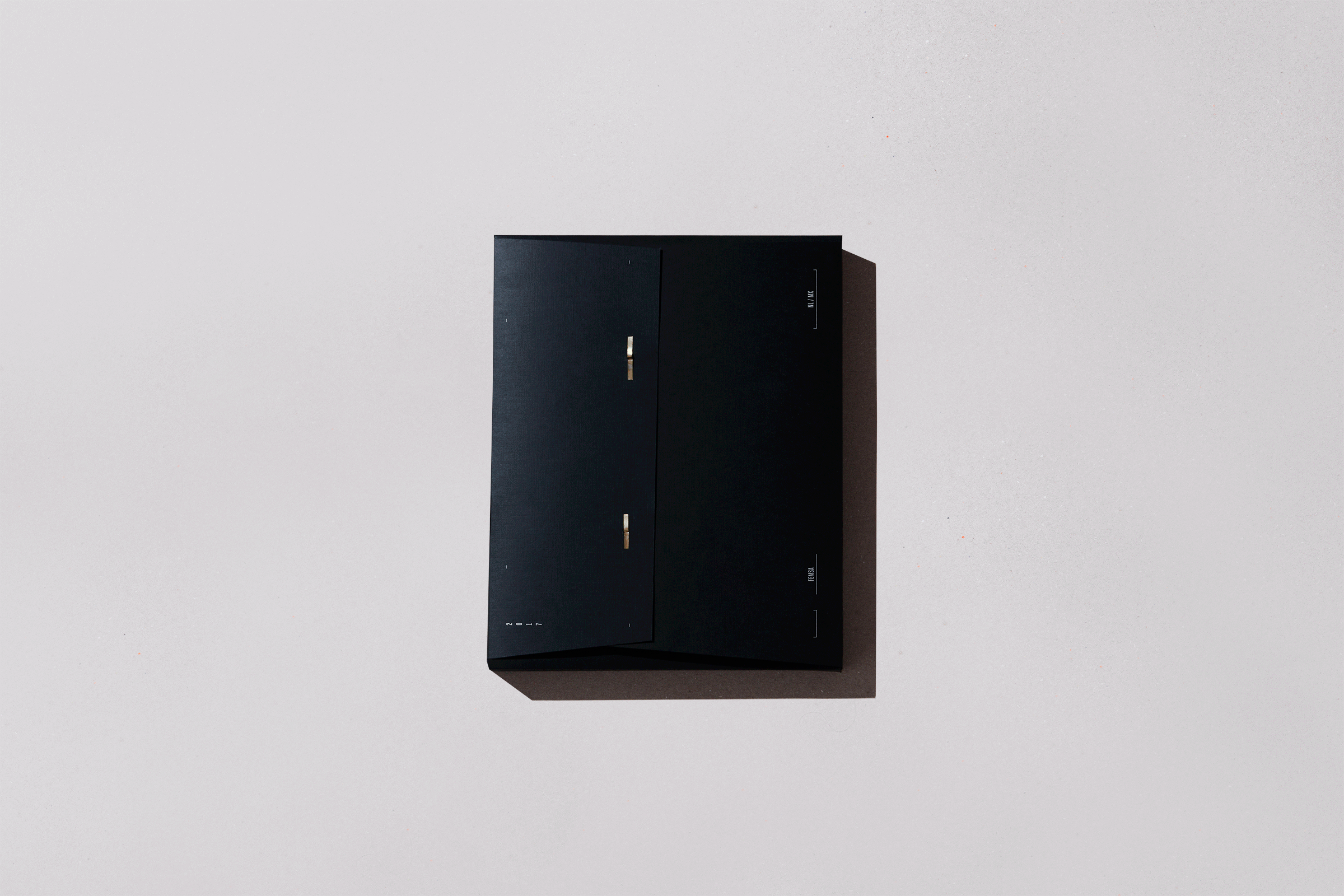
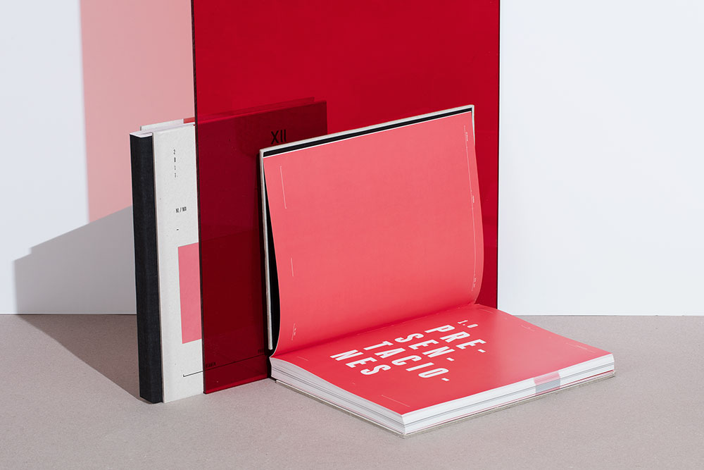
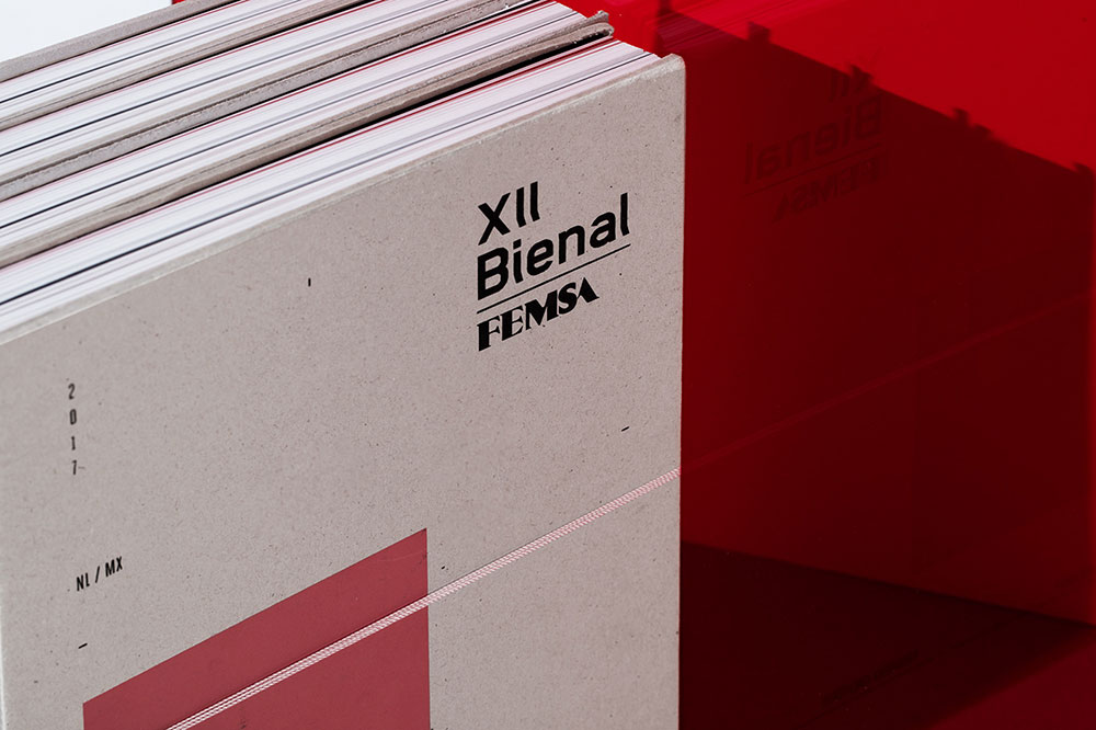
We designed a cover with a harmonic and simple proposal, which is reinforced with simple but consistent finishes. We also proposed a simple lining: with a light and matte paper that wraps the book and closes with a small adhesive. A surprise factor is created when inside, you discover the book full of fine color details.
With these premises, we have created an ephemeral packaging, which must be destroyed to enjoy its content, which requires the consumer's effort to finally get the final reward, the best organic oil from Ros Caubó.
The packaging shape comes from a real "llicorella", a type of slate stone native to the Mediterranean lands where the olive trees grow. It was produced with recycled paper pulp, an ecological material that transmits roughness but at the same time, it can be shattered easily to open it, mimicking the action of digging the soil. On the inside, a silk paper wraps the glass bottle, with bright and golden tones that gives contrasts with the previous phases of the unboxing.
On the bottle, there is an explanatory mini book attached with a rubber band, which emphasizes the idea of a treasure using a topographic map of the area, that marks the estate olive tree lands in a decorative way. We also reinforce the idea of a quality product with the contrast between a porous paper and the use of golden foil stamping.